

LICHT I. Integrating beauty and alcohol. II. Awaken to the light, Re-defining the essence.

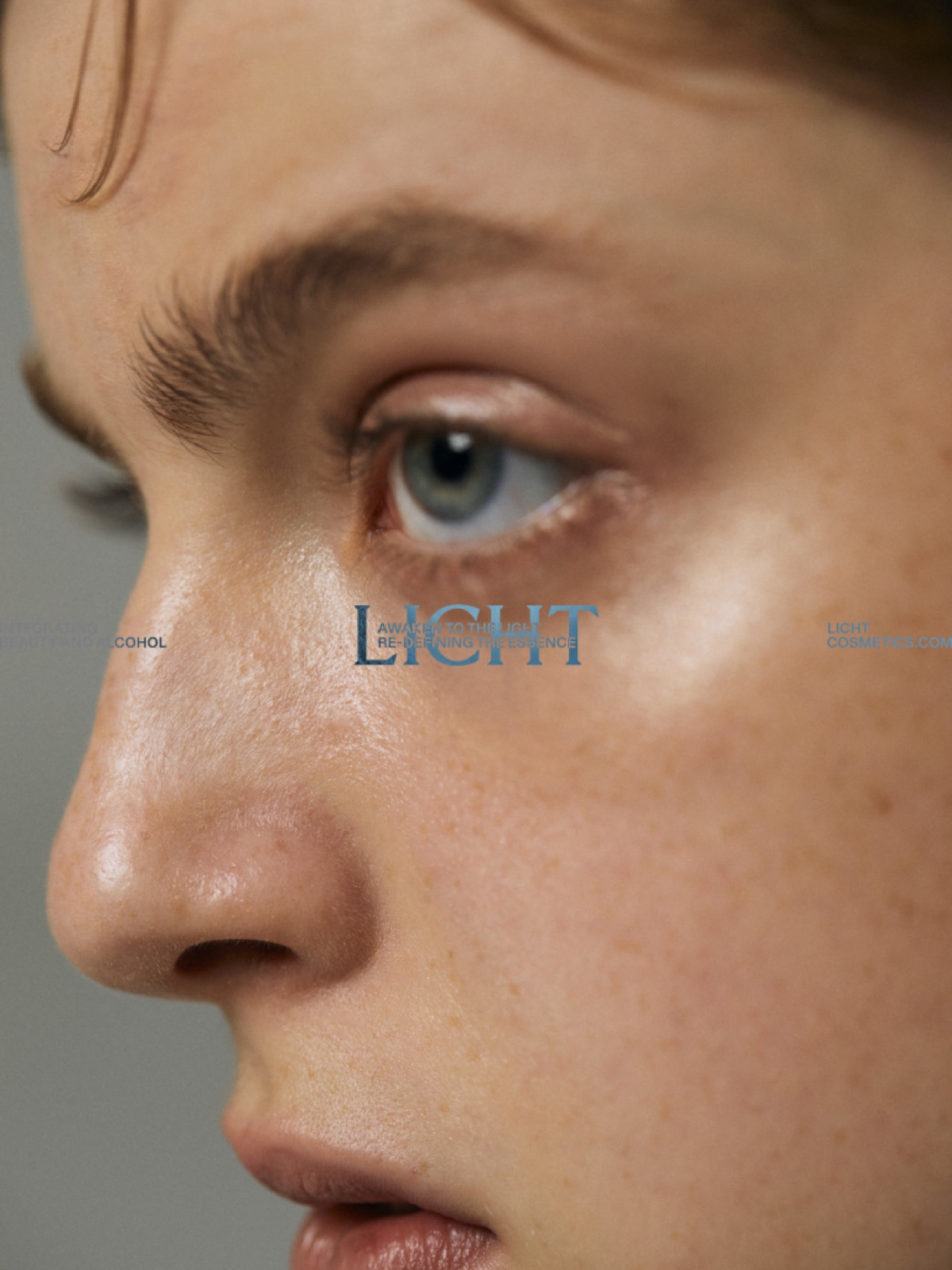
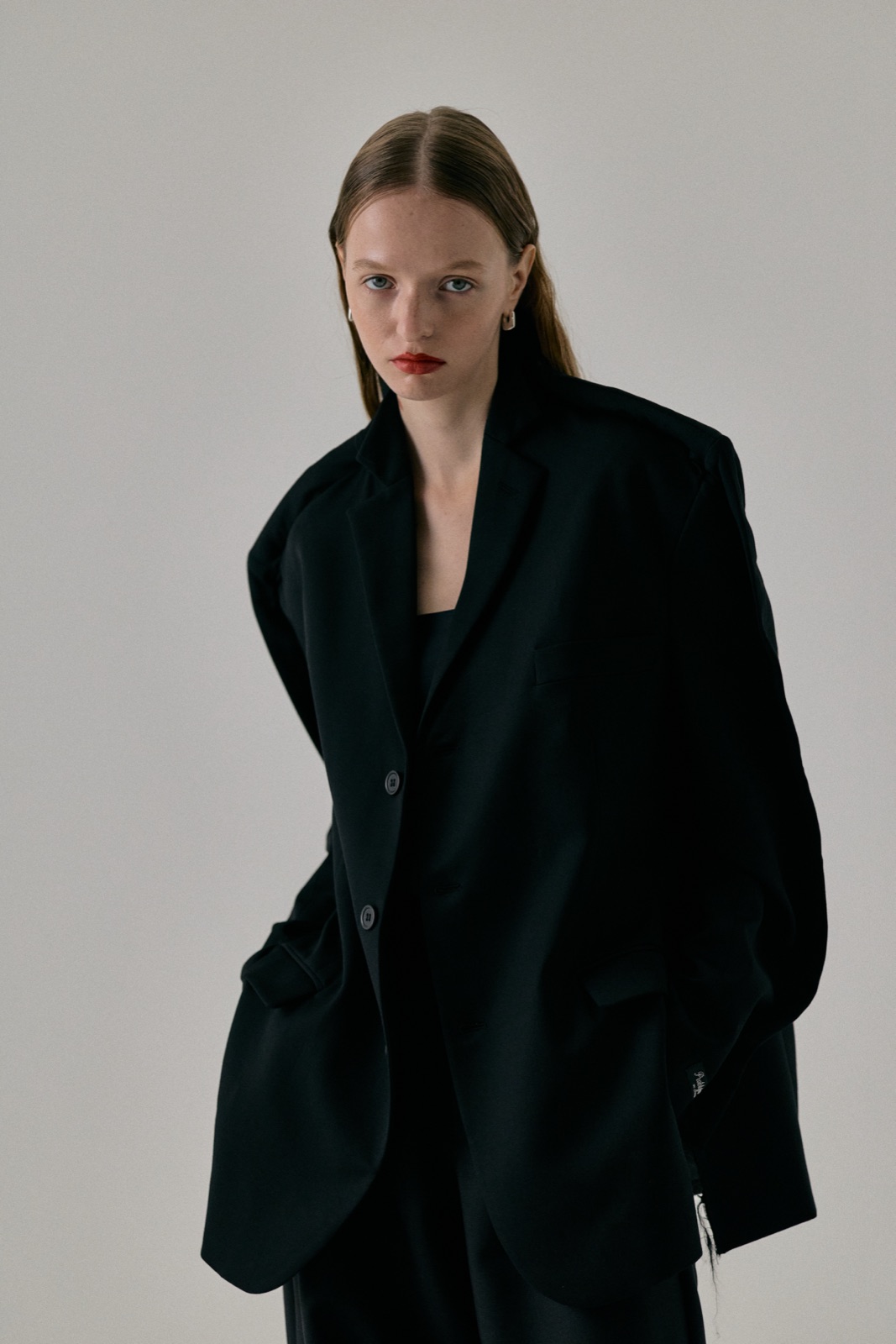
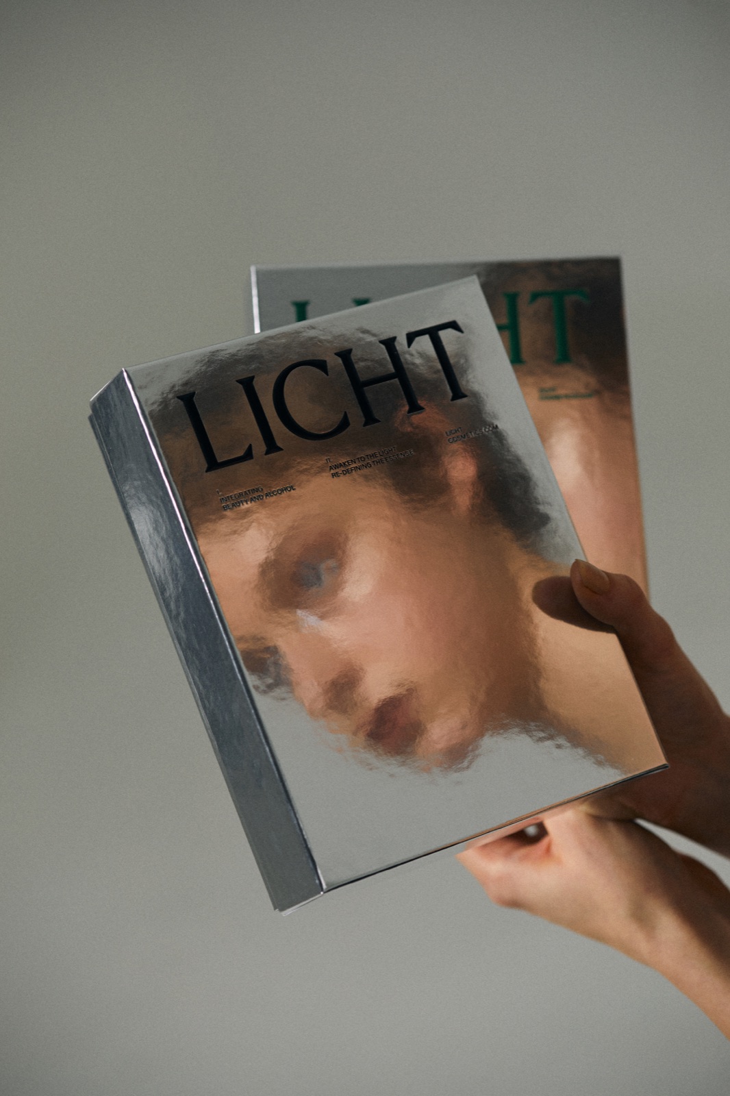
LICHT is a cosmetic brand that views light not merely as a visual element, but as a primal force that shapes existence itself.
By incorporating phenomena such as reflection, refraction, and diffusion into its visual design philosophy, the brand constructs an experience centered around transparency, spaciousness, and a quiet atmospheric presence.
From packaging and graphics to film and photography, every element is designed through the behavior of light itself. Beyond the products alone, LICHT seeks to design the very sensation of being enveloped in light.
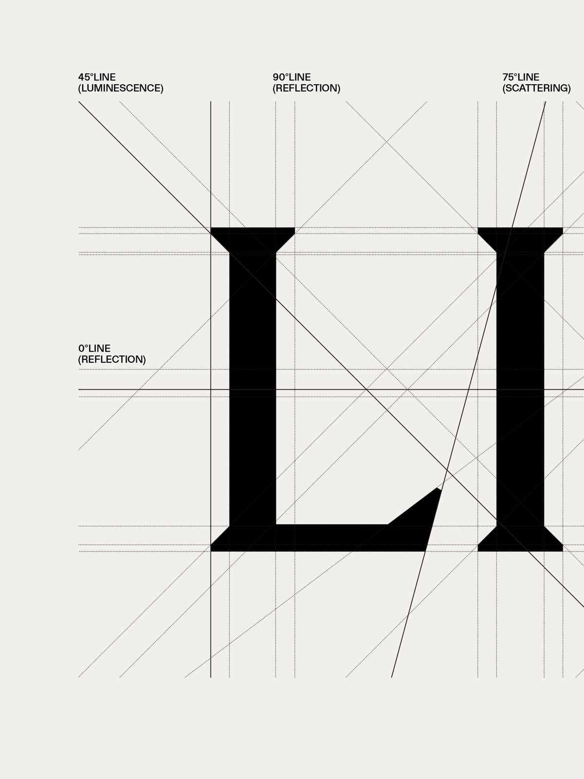
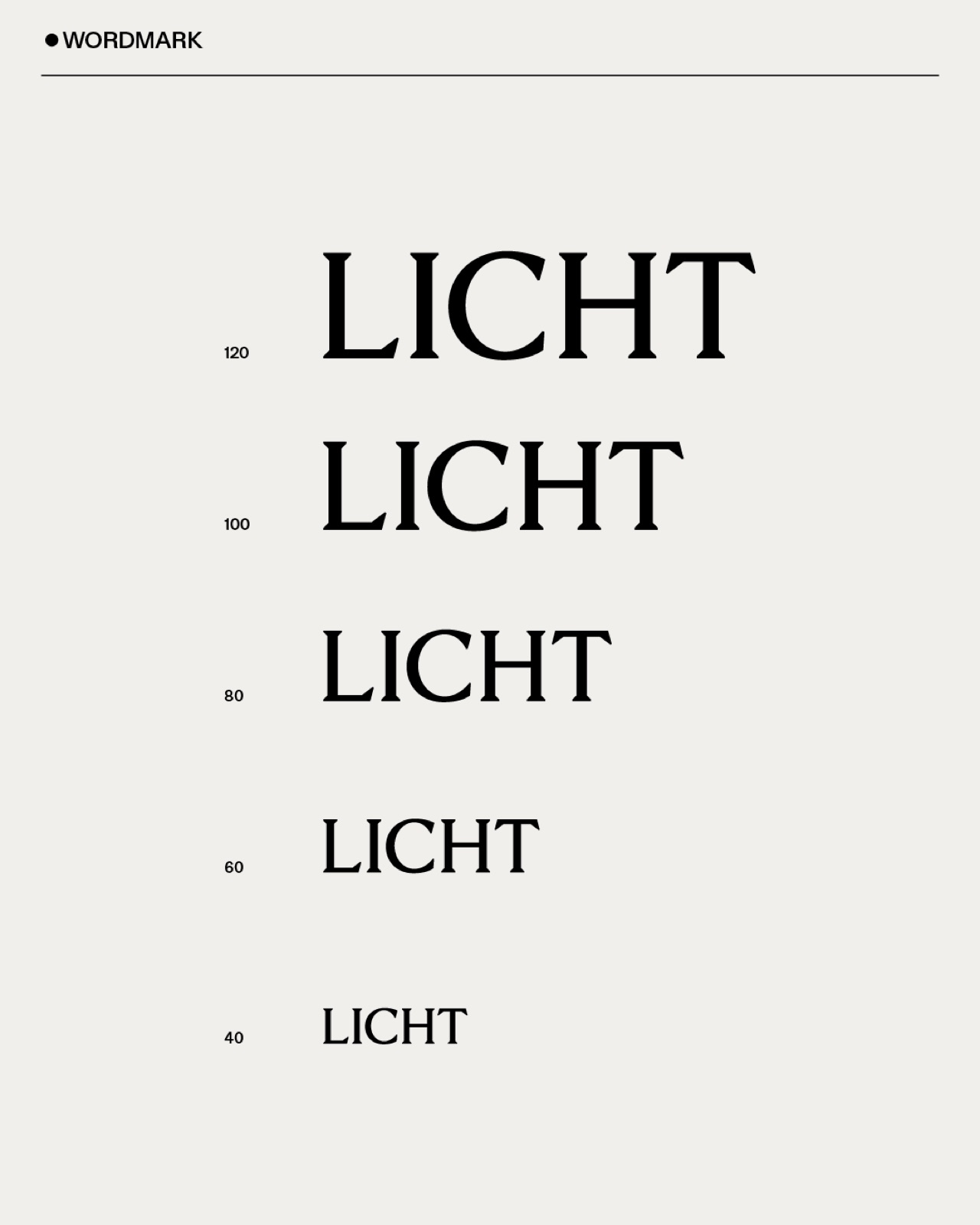
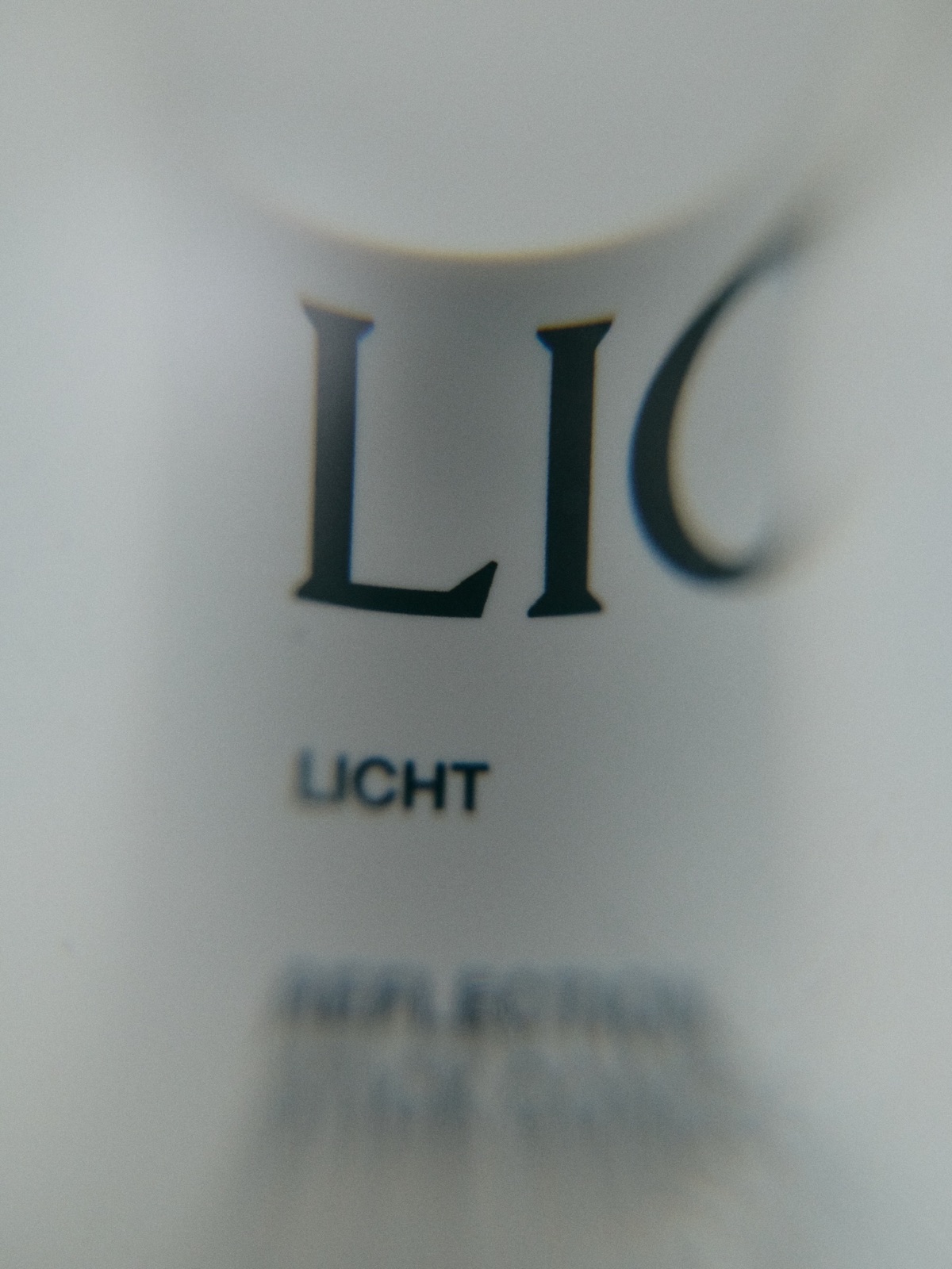
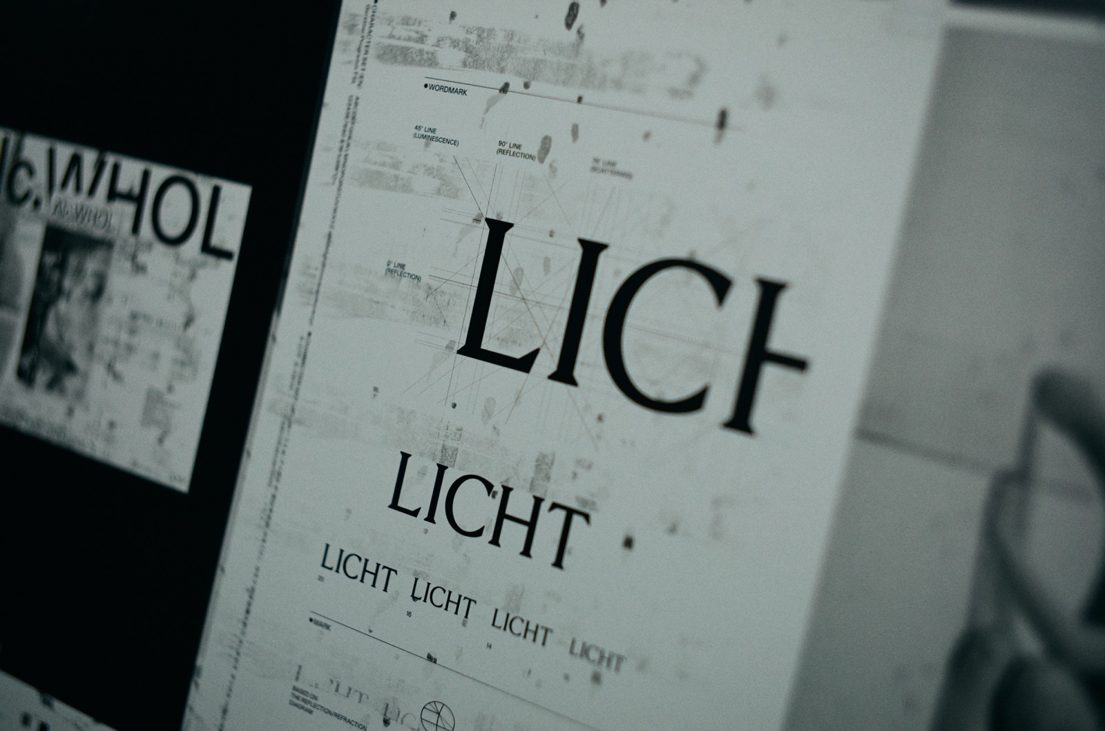
ブランド名の語源である“光”のふるまい─反射、屈折、散乱─をモチーフに、タイポグラフィや構成要素の設計を行った。ワードマークは、光が交差・反射する角度(0° / 45° / 75° / 90°)をガイドラインとして構築され、静けさと張りつめた緊張感を併せ持つ造形に。パッケージデザインにおいても、陰影や反射、余白の扱いを通じて「触れる光」としてのスキンケア体験を視覚化した。機能性に基づく構成と、感覚に訴える余白とのあいだを往復しながら、光をテーマとしたブランドの世界観を形にしている。
